Taking The Plunge
Taking the Plunge is my School of Visual Arts Thesis Film that I co-directed with 3 other amazing friends, Thaddaeus Andreades, Nicholas Manfredi, and Marie Raoult. Our film has been honored with various awards, most notably the 42nd Annual Student Academy Awards, a Student Emmy, and the first Student film ever to win a Black Cube (and Gold) by the Art Directors Club.
My responsibility on this film was Visual and Look Development as well as serving as the Creative Director.
It all starts with an idea: and that idea came to me when I had stumbled across the line, "King of Sharks," somewhere. That led to some exploratory design frames!
After those design frames, I moved on to story boarding. The way we worked this out for the film was a really fun experience. Nicholas and I took the reigns story-wise, where we would discuss various camera angles and ideas and I would draw them.
After story boarding, I really had to buckle down and crank out all the designs so that we could start actual production.


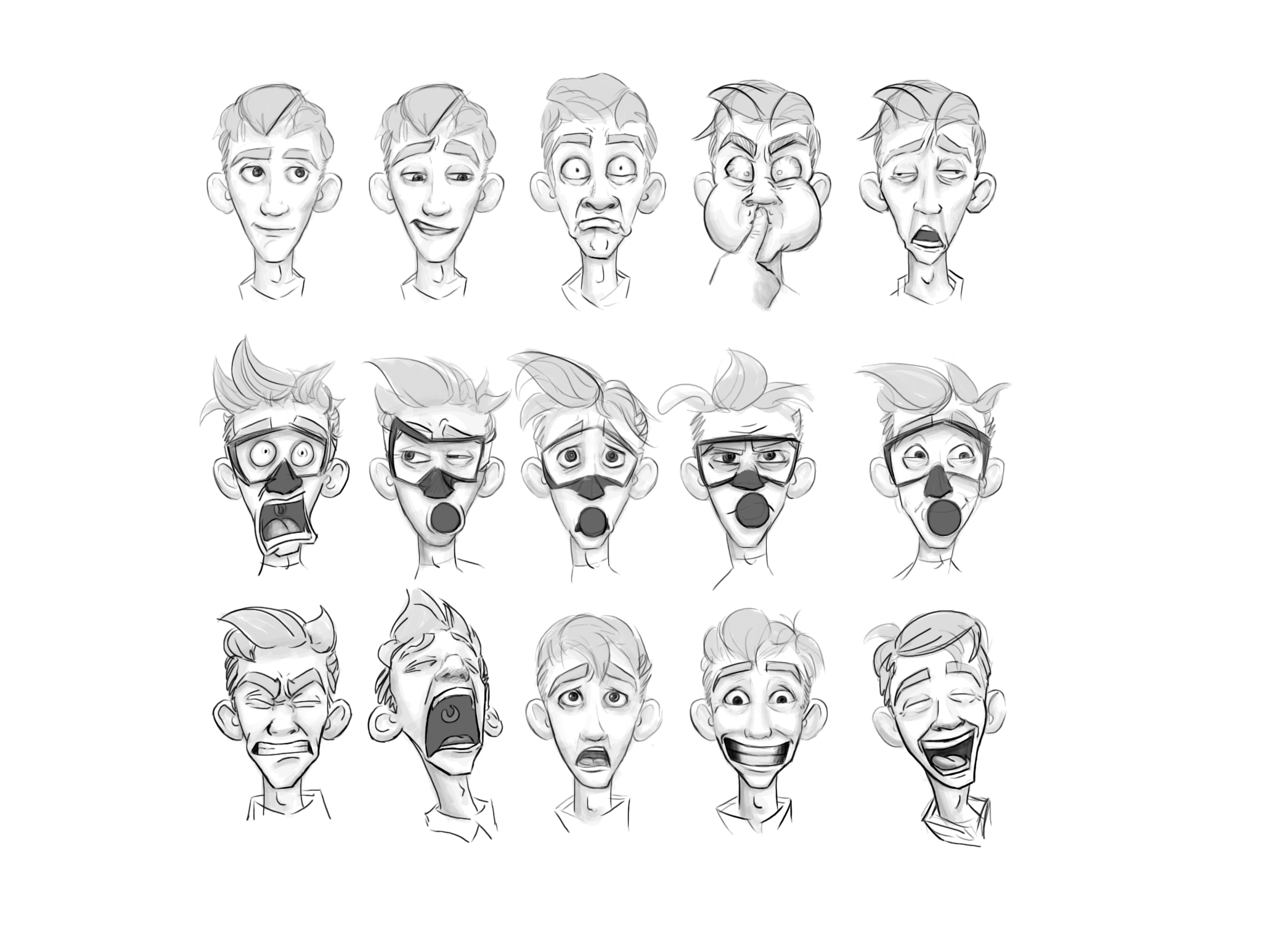
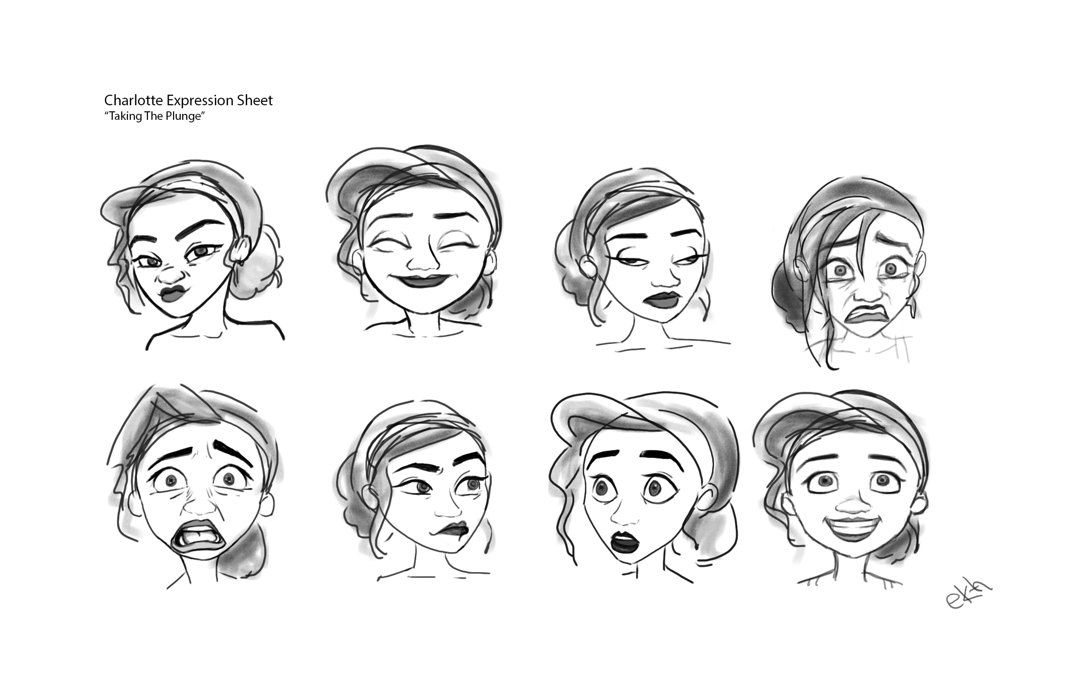


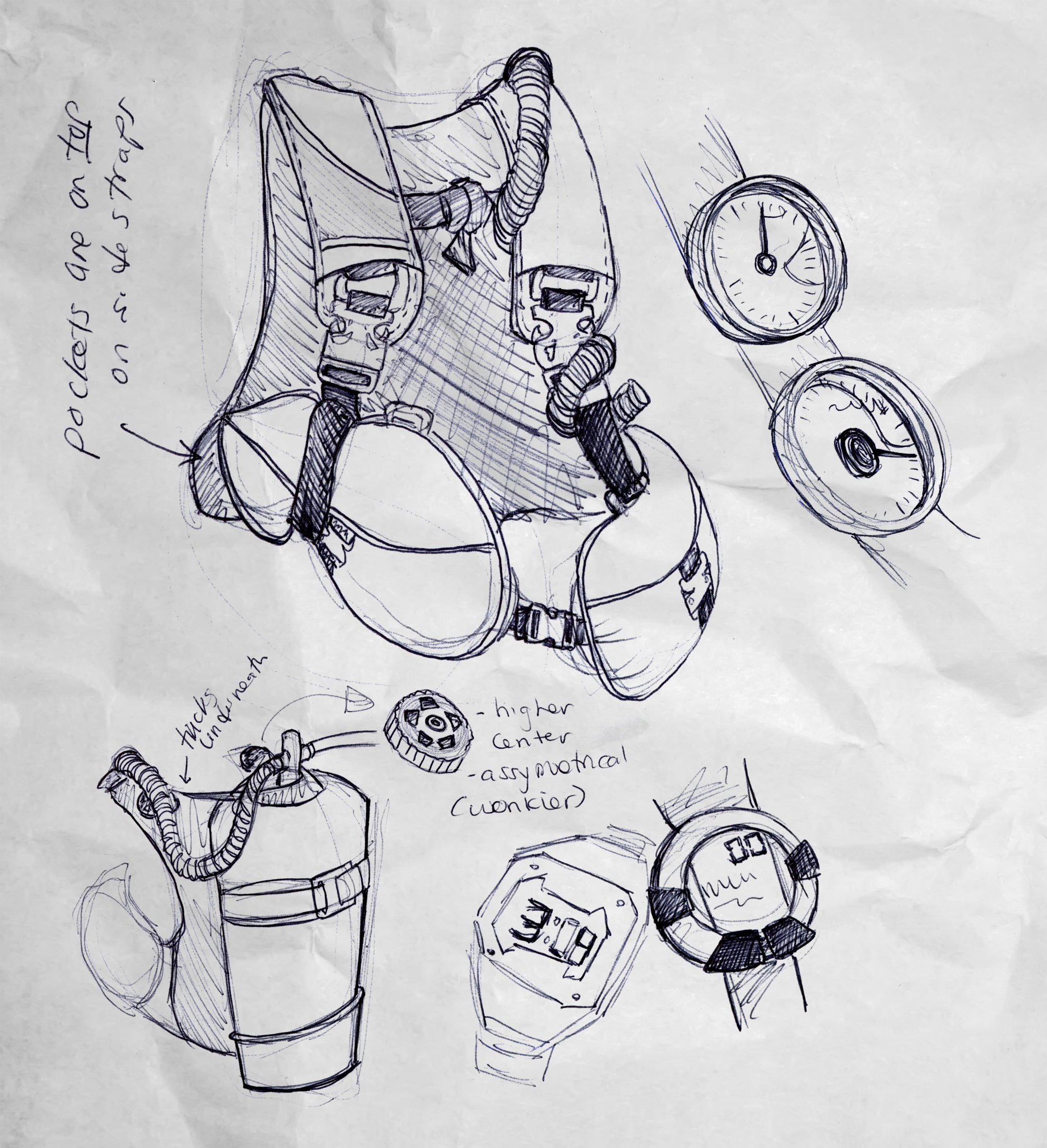


While Marie started modeling our characters, Nick was blocking out the Previz, and Thad was doing underwater tests, I was modeling the environment!


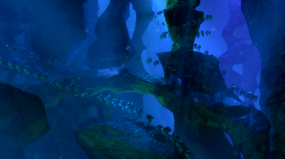
The pace started to really pick up and we started to see how big of a project this would be. I specifically had watched Jeremy Vickery's Lighting and Color Theory DVDs because I selfishly bought them for my boyfriend as a Christmas present (because I secretly was dying to watch them). It's for this reason I created a Colorscript. As the Creative Director, I needed to have a better understanding of what the modeling, shading, lighting and composting would look like in order for us to move forward.
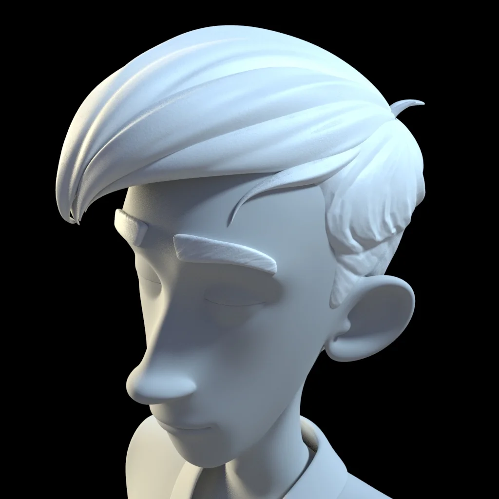
At this point, we realized we would have to cover focus's that weren't necessarily our own. But I particularly felt that this helped me a lot. It was during this time that I started modeling more. It was extremely helpful that I could design these models and have them approved by the team before I moved on to modeling them. I modeled and designed the BCD along with both of our main chararacter's hair. That was EXTREMELY fun because I had thoroughly enjoyed Hair Sculpting Tutorials by Danny Williams and was looking to have more fun with some organic sculpting exploration.


And now my biggest Thesis confession: I did not know how to Shade, Light or Composite before my thesis film. And when I realized I would have to do these things, I was terrified. It was having to learn the concept, the software, and then applying my knowledge at a high quality that scared me. However, I believed it was my responsibility to compliment my teammates' own talents. It was that, and the sheer size of our film that helped me learn faster in this tremendously face-paced environment.
I could not have accomplished what I have without the support of my team, and my own personal mentor, Eric Cunha, CG Lead at Aardman Nathan Love. In addition to that- there are countless artists online who provide tutorials, tips, tricks, videos, etc. What we do wouldn't be possible without them. And this beautiful world of sharing and collaboration is what makes animation so wonderful.
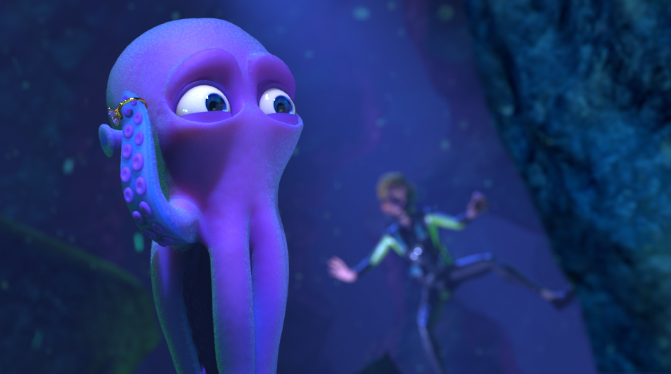


Here's our poster! I'm pretty sure everyone cringes at old projects they've worked on because they learn so much more along the way. This is especially true for this poster because I remember specifically having to use Photoshop since I had zero knowledge of nuke. I really drew a lot from Britney Lee's cut paper compositions. She has a lovely understanding of form and fluidity in her pieces.
This was truly one of the most rewarding experiences of my life. I hope you enjoy it and I always love discussing my experiences and the process!


